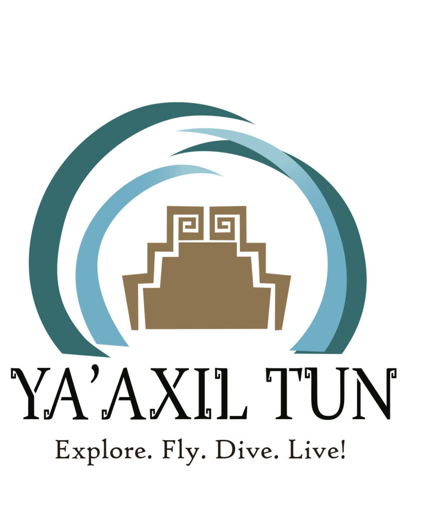
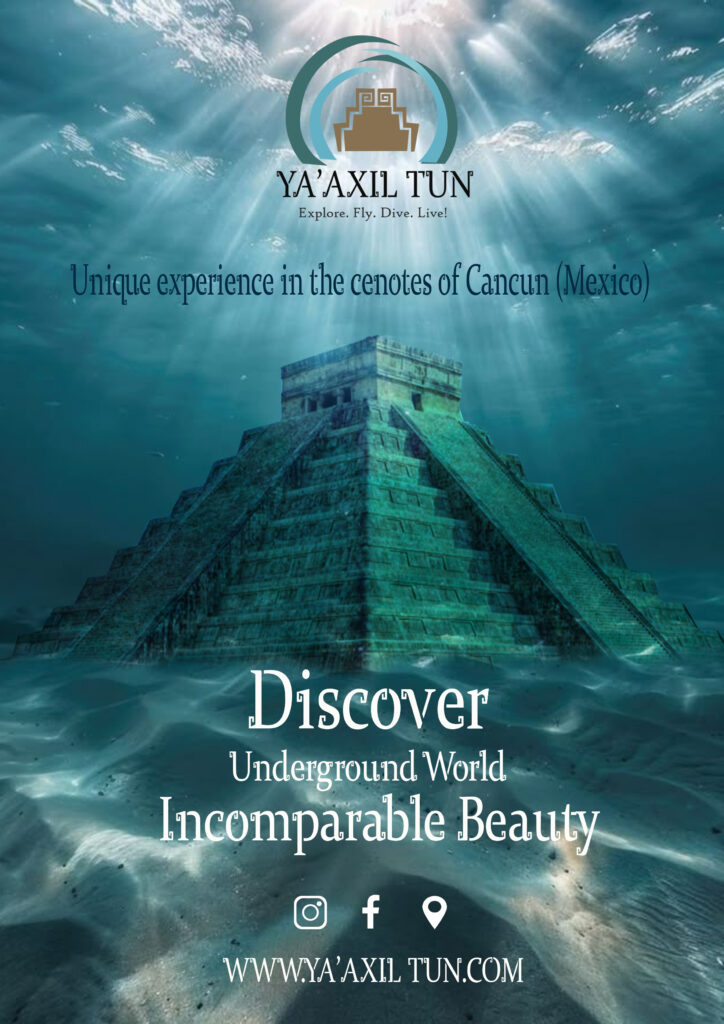
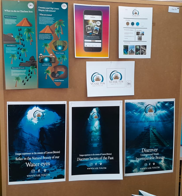
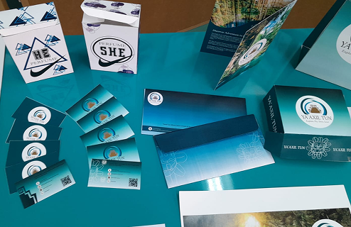
How the Logo Was Created:
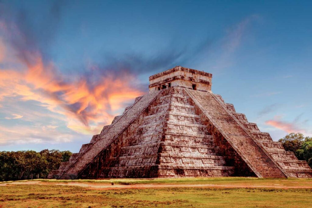
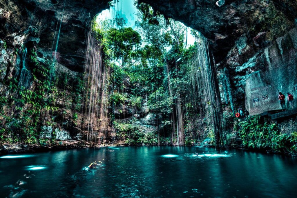
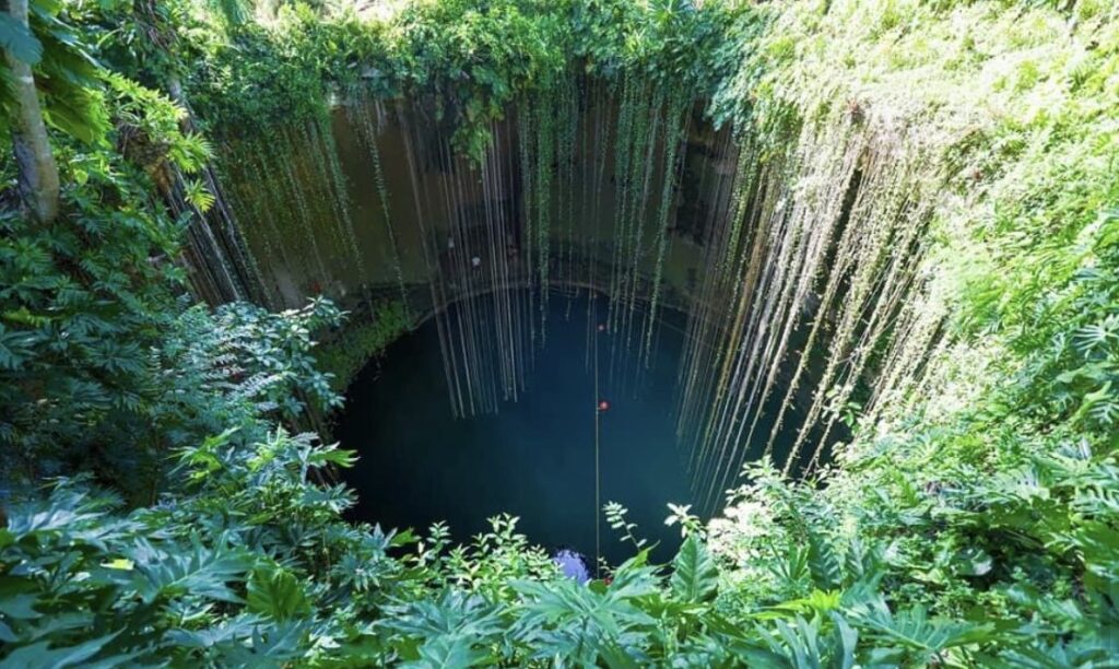
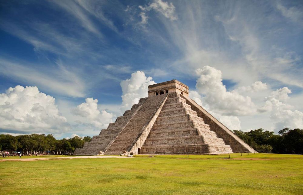
The design of this logo seeks to capture the mystical and natural essence of the Riviera Maya. The central structure originates from the pyramid of Chichen Itza, a symbol of the region's cultural heritage and architectural strength. This geometric form is embraced by fluid lines in shades of blue, representing the water of the cenotes, creating a balance between ancient stone and the fluidity of nature. Together, these elements reflect the comprehensive experience of adventure and culture that Cancun offers.
The Pyramid: Represents history, roots, and the tourist destination.
The Waves: They're not just water; they also suggest movement and dynamism (perfect for a "Fly & Dive" adventure park).
The Typography: It has decorative flourishes that give it a handcrafted and antique feel, connecting with the name in the Mayan language.